Nordic-Inspired Drawstring Bags: Crisp Color Strategies for Everyday Elegance
As Nordic design continues to captivate global audiences, cool-toned drawstring bags remain a perennial favorite among lifestyle essentials. This article goes beyond conventional color guides, distilling practical palettes directly from the natural light and shadows of the Scandinavian Peninsula. Through the seamless interplay of texture and tonal layering, we unveil how to infuse even the simplest drawstring bag with refined sophistication.
Whether you're a product designer seeking creative inspiration, a buyer optimizing a merchandise line, or a style-conscious consumer, this guide offers a practical yet artistic logic to unlock the versatile expression of cool-toned bags across multiple everyday scenarios.
Tracing Color Roots: Cultural Context in Northern Europe
1. Preferences Across the Nordic Five
- Sweden: Favors gray-blue tones reminiscent of FIKA café palettes
- Finland: Embraces forest mist gradients in muted grays
- Norway: Known for cold rust tones typical of coastal fishing ports
- Application Tip: Include color origin stories on product tags. A label like "Norwegian Harbor Gray" can justify a 15% price premium over standard gray.
Three Common Misconceptions About Minimalist Palettes
- Myth #1: Cool tones = monotony (counteract with texture variation)
- Myth #2: Only solid colors work (5% accent tones are acceptable)
- Myth #3: Lighting doesn’t matter (indoor vs. outdoor tone shifts can reach 40%)
Foolproof Basics: Timeless Pairings That Work
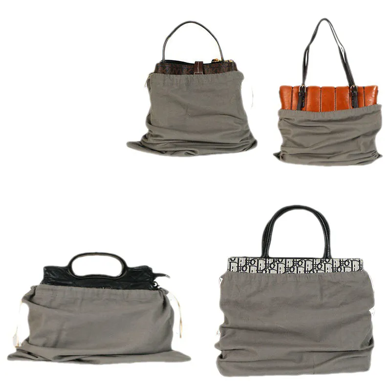
1. Elevated Neutrals: The New Gray & White
- Main body: textured beige-gray (cement wall tone)
- Drawstring: silver-gray with subtle shimmer
- Lining: pearl white for added brightness
- Best For: Office commutes, gym essentials
2. The Blue Spectrum: A Utility Classic
- Main fabric: deep navy canvas (denim-inspired)
- Lining: light blue (washed denim effect)
- Accent: metallic blue hang tag
- Best For: Student backpacks, grocery totes
Subtle Strategies: Design with Intent
1. Tonal Layering: Variations of a Single Hue
- Select three shades of gray:
- Body: medium gray
- Sides: dark gray
- Drawstring: pale gray
- Result: More dimension than a single-color bag
2. Add a Splash of Color (Strategically)
- Cool-toned base with a 5% pop color in key accents:
- Topstitching in mint green
- Cord end toggles in champagne gold
- Inner label in blush mauve
- Note: Bright color coverage should stay under smartphone size for balance
Advanced Coordination Frameworks
3. Signature Combinations
| Collection Name |
Primary Color |
Accent Detail |
Target Audience |
| Glacier Tale |
Gray-white canvas |
Ice blue stitching |
Urban professionals |
| Forest Breath |
Moss green canvas |
Pinewood-style handle |
Outdoor enthusiasts |
| Aurora Mirage |
Charcoal body |
Gradient holographic cords |
Gen Z trendsetters |
4. Special Occasion Guidelines
- Business settings: base color + dark gray piping + matte hardware for a formal touch
- Parent-child use: cool-toned body + 10% warm color markers for safety + style
- Gift bags: standard color bodies + seasonal swappable ribbons (e.g., Christmas or Valentine’s Day editions)
Textile + Tone: Perfect Material Pairings
1. Contrast Builds Character
- Rugged canvas for the body
- Glossy cords for a hint of luxe
- Matte metal grommets
- Pro Tip:
- Pair dark bags with silver-gray hardware
- Pair light bags with rose gold accents
2. Seasonal Color Coordination
| Season |
Recommended Shades |
Material Suggestion |
| Spring/Summer |
Sky blue / Mint / Light gray |
Lightweight canvas |
| Fall/Winter |
Navy / Charcoal / Deep green |
Thick twill or brushed cotton |
Everyday Maintenance Tips
- Hand-wash in cold water to preserve color
- Turn dark bags inside out when drying to reduce fading
- Use a white eraser to spot-clean canvas stains
- Styling Examples:
- Commuter: light gray canvas + dark gray cords + silver logo print
- Outdoor: navy body + orange lining + reflective cords
- Gift: ivory base + gold foil lettering + pale blue satin ribbon
FAQs: Quick Fixes and Cultural Sensitivities
- Q1: How to prevent cool-toned bags from looking dirty easily?
- A: Use naturally textured tones like "Marble Gray" to camouflage wear.
- Q2: Low-cost ways to switch up the bag's look?
- A:
- Replace the cords with colorful alternatives (under ¥2)
- Add reusable peel-off color patches
- Use themed badges in cool tones (can be sold as sets)
- Q3: Are there color taboos in different regions?
- A:
- Nordic countries: avoid large blocks of pure black
- Japan: use cool purples with care
- Middle East: limit cool greens to accent use
Conclusion
The art of styling cool-toned drawstring bags lies in visual restraint. This article maps a full framework—from cultural origins to material interaction—that decodes the complexity beneath seemingly simple design. Whether it's the rational grayscale harmony for business, or the punchy contrasts for outdoor use, the unifying principle is balance through minimalism.
In an era where sustainability drives both aesthetics and value, this method of color application does more than enhance product appeal—it redefines the visual culture of everyday goods. Because sometimes, the most powerful design begins with knowing what not to add.

 We like to do design according to all the customers' requirements, or offer them our new designs. With strong OEM/ODM capabilities, we can fill your sourcing demands.