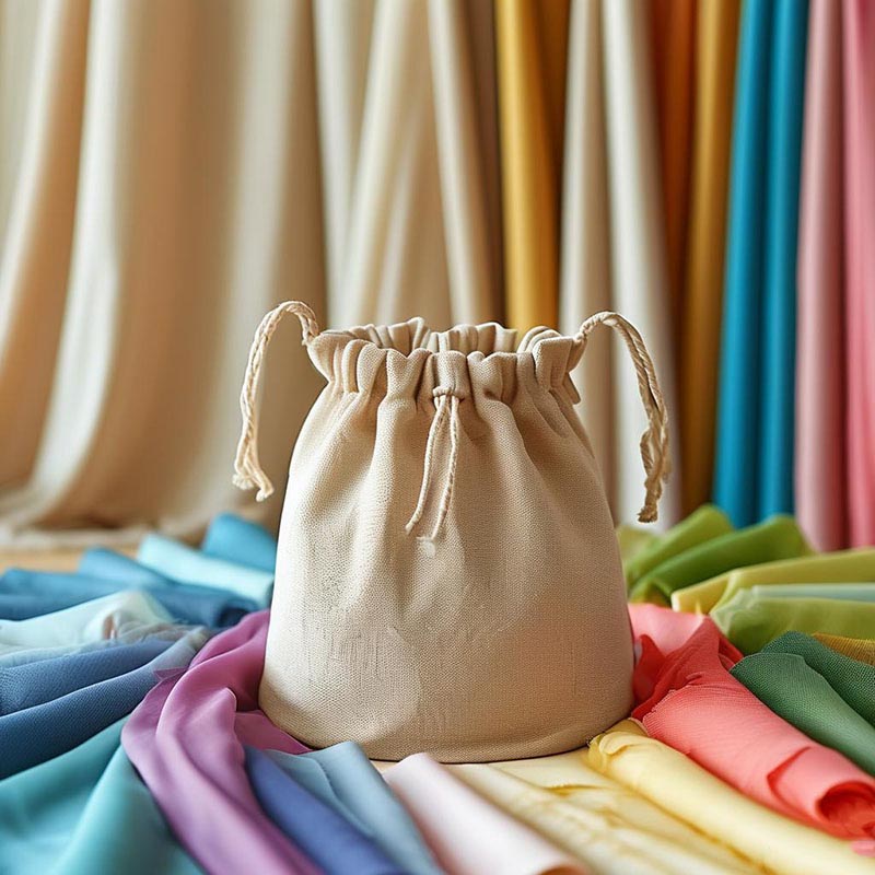
How to Choose Fabric Colors for Drawstring Bags: A Strategic Guide to Avoid Common Pitfalls
Choosing the right fabric color for drawstring bags may seem simple, but it’s actually a subtle art that can significantly impact both product appeal and production cost. As a factory specializing in export-oriented drawstring bags for over a decade, we’ve developed a “Color Selection Survival Guide” to help you avoid three major risks: color inconsistency, fading, and cost overruns.
How to Choose the Right Fabric Color for Drawstring Bags
1. Color Preferences by Region
- Europe & North America: Favor minimalist aesthetics with natural tones like off-white, light gray, and khaki. Note: eco-friendly fabrics (e.g., recycled materials) may appear duller—communicate this in advance.
- Japan & Korea: Prefer low-saturation colors such as dusty blue and sakura pink. Light fabrics should be treated with stain-resistant coatings.
- Middle East: Metallic tones like gold and silver are popular. However, ensure the dyeing process can withstand high temperatures to prevent fading under strong sunlight.
- Universal Tip: Avoid colors that easily show dirt, like pure white, unless specifically requested by the customer.
2. Match Color with Fabric Type
- Polyester: Holds bright colors well and resists fading—ideal for neon yellow, royal blue, etc.
- Cotton: Pairs well with vintage tones like light coffee or muted green. Note: dark cotton fabrics may whiten after washing—use with caution.
- Nylon: Light colors may be see-through; consider using dark tones or adding inner linings.
- Cost-saving Tip: Standard colors (black, white, gray) are widely available and cheaper. Special colors like rose red often require custom dyeing, increasing cost.
3. Consider Practicality and Durability
- Darker colors are better at hiding stains like coffee or oil.
- Light colors (e.g., beige, light pink) should be treated with waterproof and anti-stain coatings.
- Outdoor use: Choose UV-resistant fabrics to prevent fading (e.g., army green fades less than sky blue).
- Printed designs: Light-colored prints work better on dark backgrounds, and vice versa. Otherwise, multiple printing passes may be required, increasing cost.
“Color Strategy” in Drawstring Bag Production: 5 Key Dimensions
1. Market-Specific “Color Sensitivities” (Beyond Cultural Taboos)
- Europe/US: Low-saturation tones are often tied to sustainability certifications (e.g., GRS-compliant fabrics are limited to specific color ranges).
- Middle East: Metallic dye finishes must withstand high heat and sun exposure to avoid oxidation.
- Japan/Korea: Demand for light UV-resistant colors for outdoor scenarios.
- Southeast Asia: High-opacity colors help mask uneven tones in recycled materials—adding economic value.
2. Dyeing Limitations in the Supply Chain
- Color deviation across materials: Same Pantone code may show ΔE differences on polyester vs. cotton.
- Small-batch dyeing: Below 500 meters, only limited standard color options are cost-effective.
- Stonewashed/vintage finishes: Initial color must be 10–15% more saturated to allow for wash-down effects.
3. Hidden Value of Functional Colors
- Stain testing: Black polyester vs. black cotton differ in post-cleaning results—impacting maintenance cost.
- Neon colors: Useful in warehouse logistics when paired with RFID tags for quick visual identification.
- Two-tone inner/outer fabrics: Helps optimize inventory by reducing separate lining material stock.
4. Color and Packaging Cost Correlation
- High-contrast prints: Improve box labeling clarity, reducing mislabeling in overseas warehouses.
- Transparent PE bag packaging: Requires more vibrant main colors to stand out.
- Neutral tones: Allow reuse in multi-SKU bundling—reducing storage complexity.
5. Color Management in Digital Manufacturing
- Digital direct-to-garment printing: Limited color gamut; cannot reproduce metallic tones like traditional screen printing.
- Cross-border e-commerce traps: Images may distort real colors—recommend syncing physical Pantone cards with digital swatches.
- 3D rendering: Follow strict color calibration formulas (e.g., Pantone-to-DIC conversions).
3 Low-Cost Color Testing Methods (Factory-Proven)
1. Tea Stain Test
Drip cold-brew tea (not hot water!) on fabric and wipe after 20 minutes:
- Cotton: If stain area > 3cm², stain resistance treatment is needed.
- Polyester: If stain depth < 15%, it’s acceptable.
2. Flashlight Test
Shine a mobile phone flashlight directly on fabric in a dark room:
- "Snowflake reflection" = over 50% recycled material content.
- Even reflection = proper dye penetration.
3. Scissor Edge Test
Observe fabric edge after cutting:
- Cotton: Fraying is normal.
- Polyester: If edges fuzz, dye may have weakened fiber strength.
3 Hidden Truths About Color Inconsistencies
- Misleading Digital Swatches
- Case: Buyer-uploaded photos on e-commerce sites vs. actual product—classic color difference scenario.
- Solution: Request clients to send textile Pantone swatches (not paper), or share fabric videos taken at a 45° angle under flash.
- Moisture Content Changes Fabric Color
- Cotton may darken by 10% during humid seasons in Southern regions (lab-tested).
- Solution: Pre-shrink treatment or use 35% polyester blended fabric.
- 3 Risky Colors to Avoid
- Fluorescent Orange: Fades when exposed to humidity during ocean shipping.
- Pure White: 67% chance of yellowing after 3 months of storage.
- Metallic Silver: Reacts with disinfectants, forming black spots.
Recommendations to Avoid Pitfalls
- Always request samples: Screens and fabric swatches often differ. Confirm with physical samples before mass production.
- Check dye uniformity: Multicolored fabrics (e.g., camouflage) must be checked for uneven dye patches.
- Leave fabric surplus: Dark colors may expose white edges when cut—reserve 5% extra fabric.
- Seasonal hues: Light shades (e.g., mint green) for spring; warm tones (e.g., caramel brown) for autumn—align with market trends.
A Simple 3-Step Color Selection Process
- Define usage: Go dark for daily use; choose bright colors for gifts and customization.
- Check budget: Standard colors are cheaper; custom shades may add 20–50% cost.
- Run basic tests: Use tea or soy sauce to test cleanability of fabric samples.
Conclusion
Choosing the right color for drawstring bags is a balancing act between functionality, fabric properties, and cost. Remember these key points: dark colors hide stains and are more practical; special colors require sampling; seasonal trends matter. For beginners, start with classics like black, white, or navy, and perform a simple tea-stain test to quickly identify colors that are both popular and hassle-free.
Appendix:
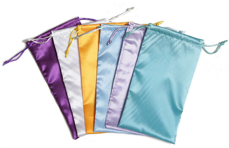
List of commonly used fabric colors with White background:
List of commonly used fabric colors with Black background:


 We like to do design according to all the customers' requirements, or offer them our new designs. With strong OEM/ODM capabilities, we can fill your sourcing demands.