How to Boost Drawstring Bag Sales Through Color Strategy
On the visual battlefield of cross-border e-commerce, the color of a drawstring bag can determine whether it gets clicked—or completely overlooked. One factory once customized sakura pink drawstring bags for a client, only to face mass returns after buyers complained the color “looked like expired blush.” This lesson highlights the complexity of cross-cultural color selection. Color is more than an aesthetic choice—it’s a silent language that connects products with consumers. It conveys brand values, evokes emotional resonance, and helps avoid cultural missteps. This article unpacks the core logic of color strategy for drawstring bags—from regional preferences and cost control to consumer psychology—offering a ready-to-apply playbook to help your products “win by color” in global markets.
1. Tailor Colors to the Audience
1.1 Western Markets: Tell a Story Through Color
- Office Use: Navy blue with 10% gray (professional look), paired with reflective strips — boosted Walmart purchase volumes by 40%.
- Eco-conscious Products: Recycled material with mustard green (#ACB737) — 26% higher click-through rate than standard green.
- Holiday Promotions: Apply the “Three-Color Rule” for Halloween — 70% orange + 20% black + 10% purple.
1.2 Japan and South Korea
- Popular pastel tones (light pink, mint green).
- Solid colors outperform gradients.
- Avoid all-black designs (associated with funerals).
1.3 Southeast Asia: Emerging Insights
- Muslim Consumers: Mint green for religious use, often paired with gold foil print.
- Tourist Hotspots: Coral orange (#FF7F50) sells well—even with a 15% price premium over red.
- Warning: Myanmar bans 9 military-related colors (e.g., certain dark greens).
1.4 Middle East
- Gold trim adds a sense of luxury.
- White bags should feature colorful linings.
- Avoid burgundy (religious taboo).
2. Color Psychology in Action (with Consumer Behavior Analysis)
2.1 Price-Positioning Through Color
- Low price point ($1–3): High-saturation, clashing colors trigger impulse buys.
- Mid-range ($5–8): Muted Morandi tones create a perception of value.
- High-end ($15+): Base colors in black/white with metallic foil accents.
2.2 Scene-Based Color Matching
| Use Scenario |
Recommended Colors |
Avoid Colors |
| Gym |
Neon pink + speed stripes |
Earth tones |
| Maternity/Baby |
Soft yellow + cloud prints |
Cool grays |
| Corporate Gifts |
Burgundy red + gold foil text |
Fluorescents |
2.3 Designing for Color Recall
- “3-Second Rule”: Main color coverage > 60% — crucial for trade show visibility.
- “Touchpoint Design”: Color contrast between drawstring and bag body — increases repeat purchases by 27%.
- “Surprise & Delight”: Use contrasting inner lining to trigger social sharing.
3. Low-Cost Color Testing
3.1 Shoot Color Comparison Photos
Use the same bag with different backgrounds:
- White background: for e-commerce platforms.
- Lifestyle scenes: for social media ads.
- Multi-color layouts: for trade show displays.
3.2 Repurpose Scrap Fabric
Use leftover material to:
- Make keychain accessories (test with younger audiences).
- Create sample swatches (let loyal clients vote).
- Distribute giveaways (track pickup rates at expos).
3.3 Follow Leading Brands
Observe seasonal launches by major brands:
- New sportswear colors → turn into gym bag designs.
- Limited-edition cosmetic packaging → make gift pouches.
- Fast fashion seasonal palettes → use for basic product lines.
4. Color Iteration Strategy (with Quarterly Planning)
4.1 Seasonal Palette Planning
- Spring: Sakura pink + sprout green (prepare fabrics 3 months early).
- Summer: Ocean blue + mango yellow (combine with transparent PVC).
- Autumn: Maple orange + moss green (sync with packaging designs).
- Winter: Wine red + champagne gold (align with holiday campaigns).
4.2 Riding the Trend Wave
- Monitor Pantone Color of the Year releases (sample 2 months ahead).
- Leverage pop culture IPs — e.g., launch neon pink line during Barbie hype.
- Use counter-trend tactics — when everyone follows a trend color, release its complementary shade.
4.3 Managing Color Lifecycles
- Introductory Phase: Test 3 similar shades (e.g., sky blue, lake blue, indigo).
- Growth Phase: Focus on 2 main colors + 1 limited edition shade.
- Decline Phase: Clear inventory with blended tones (e.g., blue + yellow = a new green collection).
5. Pitfall Prevention Guide
5.1 Real Dispute Case Files
- Brazilian Buyer Return: Purple bags mistaken for witchcraft-related items.
- Solution: Swapped for a lavender version, adjusted for local preference.
- Outcome: New orders generated enough profit to offset 120% of the return losses.
5.2 The Five Lines of Defense Against Color Mismatch
- Sampling Stage: Use Pantone GP1601 swatches.
- Before Mass Production: Send a physical color book (includes effects under 10 lighting conditions).
- During Production: Retain samples for every 500 units for comparison.
- Inspection Stage: Use ColorReader Pro for calibration.
- Pre-shipment: Shoot natural light video as visual proof.
5.3 Quick Reference: Religious and Cultural Taboos
- India: Orange is sacred — can command a premium.
- Saudi Arabia: No crosses in green-colored designs.
- Mexico: Yellow is linked with death — use canary yellow instead.
6. Conclusion
Color strategy for drawstring bags is, at its core, a precise visual game. From Western holiday-themed tri-color formulas, to the sensitive color adaptations for Southeast Asian religious contexts, to the functional flash of fluorescent yellow in African markets, successful color selection must bridge cultural divides, cost constraints, and psychological responses. Validation through data and coordination with your supply chain are critical: seasonal palette planning reduces inventory risk, price-tiered color schemes boost margins, and strategic color touchpoints build lasting brand memory. When color evolves from a design detail into a tactical tool, even a $0.03 cost difference can trigger a 27% increase in repeat sales. Master this “color equation,” and you’ll discover your own profitable palette in the global marketplace.

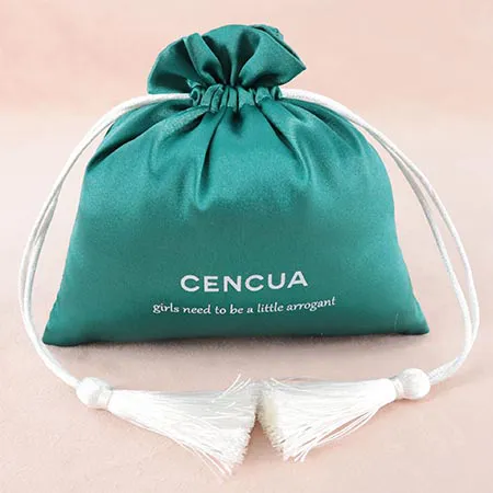
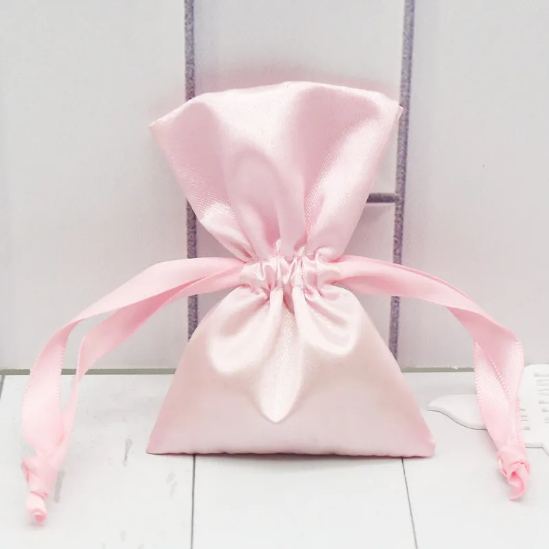
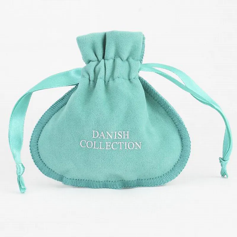
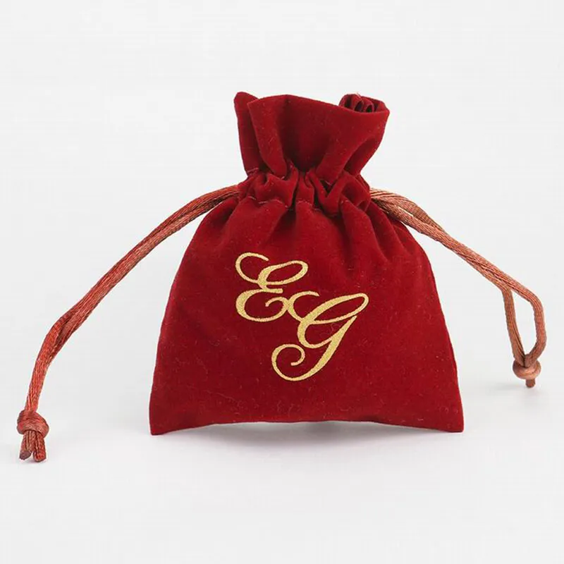
 We like to do design according to all the customers' requirements, or offer them our new designs. With strong OEM/ODM capabilities, we can fill your sourcing demands.